Creating a page with prices: psychology pricing page

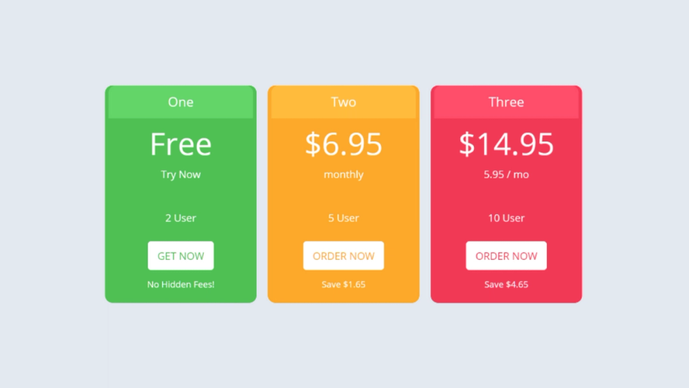
Pricing page – the very page on which we choose one of 2-3 options for subscription, services and product picking – requires a special approach to development.
The pricing page is the focus of the best internet marketing achievements. Its appearance, content, influence on the psychology of the consumer as a whole determine the success of your sales.
Here is one of the most interesting studies of human behavior, which is called The Jam Study. To conduct it, scientists once went to a grocery market in California, exhibiting 24 types of jam for tasting, and then every few hours reducing the number of options to 6 jars.
And here's what's most surprising about this sweet study (aside from being able to eat jam): Regardless of the number of jars on the shelf, the average consumer has only tasted two flavors. 30% of consumers who chose and made a purchase among fewer options compared only 3% of all tastes presented.
Project manager business professor Sheena Iyengar said that for people, having too much choice can actually be tedious and unnecessary.
Choice is offered everywhere, especially when creating selling pages for an online store, software development company or providing any services. We always offer consumers a choice.
What color are your call-to-action buttons? How many options are there on your pricing page? Do you use static images or GIFs? How we offer people our products and services has a direct impact on conversions and business success.
For software development businesses, pricing page is the hottest page of the site, which is at the center of marketers' efforts. After all, this web page answers every customer's main question: how much will your program/service cost me?
On this page, you should use a number of psychological techniques:

Conversion and A/B testing expert Nick Disabato believes that a pricing page is the main place where the client's emotions, reflections and attention are focused.
"Over the past five years, I have conducted research-based A/B tests for several dozen SaaS companies, and concluded that the pricing page is the main point of communication between consumers and the company's website. I analyzed every heat map, GA funnel, and behavior logs that indicate a broad, ongoing interest in the cost of services. The way you talk about pricing publicly is one of the most important decisions the software development business makes," says Disabato.
Your customers are primarily focused on either prices or product/service characteristics. The first category is the people we need to think about when creating an effective pricing page.
The wrong pricing page can be so unconvincing and blurry that users will leave or go on a free trial. It can become a wide window of opportunity or a real "bottleneck" that can stop the growth of business.
Do I need to make a pricing page on the site
Before delving into the mechanics of pricing page, let's talk about why a commercial site needs it and whether it is needed at all. Are you surprised that we ask ourselves such questions? Almost every company has it, right?
Not necessarily. We need to talk about this because a selling pricing page can distract your leads from turning into real customers.
CEO and co-founder of EchoSign (now Adobe Sign) Jason Lemkin argues that some companies have every reason not to set their prices at all.
The essence of Lemkin's objection is as follows:
- Some products are subject to complex conditions, including discount opportunities. At a certain point, the terms of the deal become too complex to fit into a simple table for comparison.
- A certain percentage of consumers put characteristics and status above cost. They're just looking for a good solution without worrying about the price. For them, the list itself with prices creates a feeling of "cheapness", not worthy of their level.
Therefore, if your target audience consists of large companies and very wealthy VIP clients, having a pricing page on the site may be undesirable.
Demo versions of your product or service are the best option.
Pushing users to a demo version can lead to high conversions in many cases, but not for a B2B business.
Before you and your team take the time to revise the pricing page, consider whether the "demo only" option is appropriate. As a rule, demo versions are converted an order of magnitude higher than the overall conversion rate.
DOC — the principle of creating a pricing page
So, we have considered the version of the demo version and decided to include it in our page.
Your pricing page, like the rest of a commercial site, contains three elements:
- Design — page design;
- Options — choice of options;
- Content — content.
From the first letters of this trinity, DOC appeared - the fundamental principle on which the development of an effective pricing page for business is based.
Along with standard practices, the pricing team must have an understanding of psychology, possess long-standing copywriting techniques, show interest in web design trends, and possess a large dose of humility and flexibility when real data overturn established dogmas and require new solutions.
D — page design
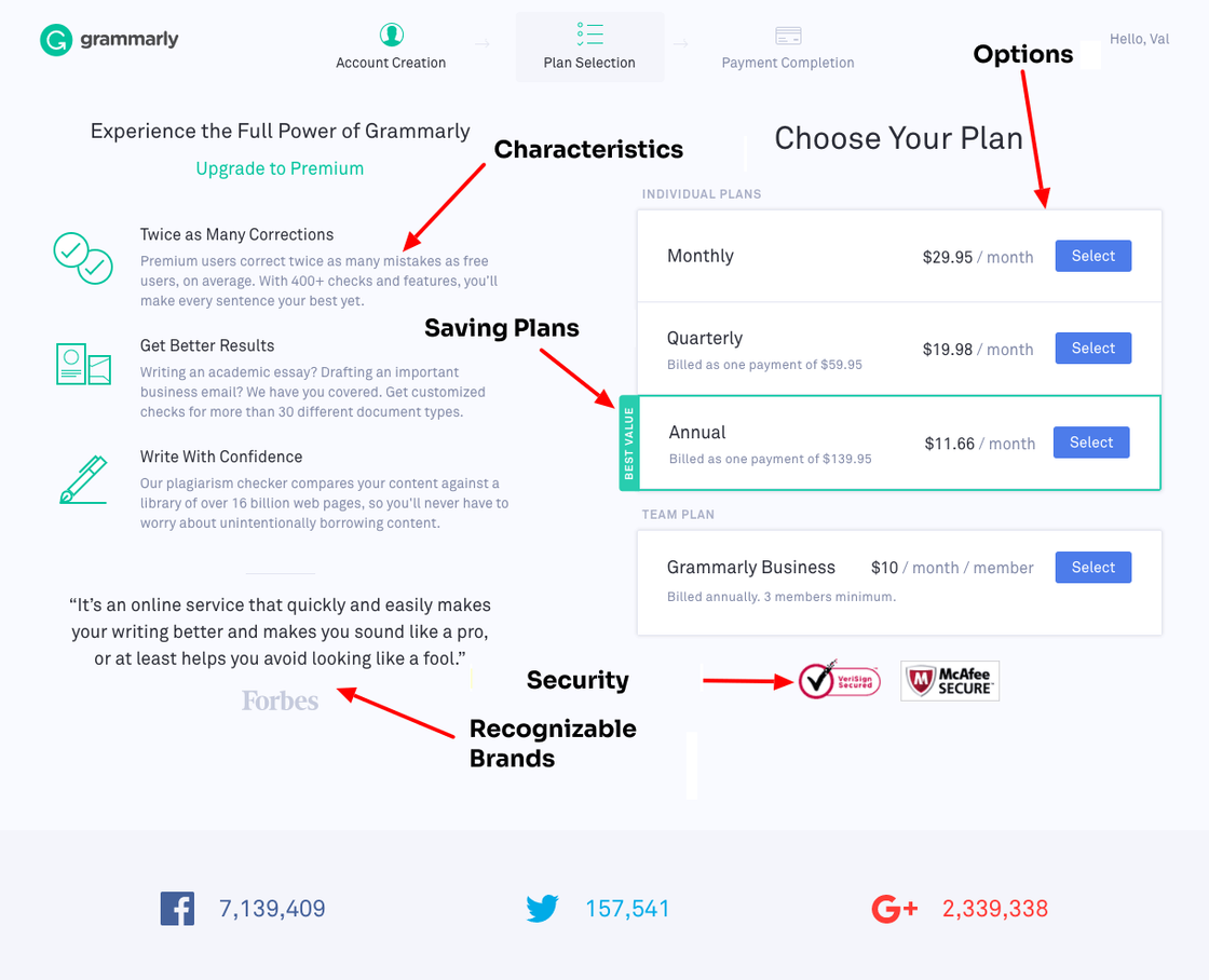
The formula of the pricing page looks pretty consistent:
- Specify your prices;
- Add features that are available in each pricing tier;
- Use reviews and/or recognizable logos;
- Highlight the plan you really want people to buy;
- Show off your free trial, if any;
- Add security symbols and/or a money-back guarantee.
It seems that the formula for success is ready? Plug in the elements you need, add gradients, or a few eye-catching colors, and off you go to conversions. But is it that simple?
Of course not! If that were the case, you'd design the perfect page in a day.
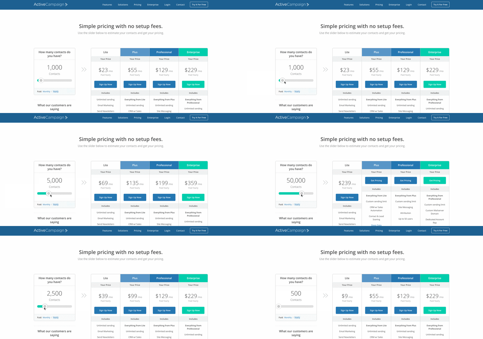
You can use a sliding scale, similar to the ActiveCampaign website:

On other sites, designers manipulate the order of listing plans from the cheapest to the most expensive. Perhaps there's actually a formula for getting customers to do what you want them to do?
Check out the results of a recent study by the CXL Institute:
- Regardless of the page layout and the number of options, consumers spend the most time looking at the first two product/service/fare offerings that have been listed in left-to-right order.
- Consumers tend to read about expensive offers faster and longer if they are placed on the left side of the table, in the first or second column.
- Expensive packages are chosen most often if they were listed first.
What's most surprising about the CXL Institute study is that color choices, icon use, and other design elements didn't matter.
Disappointing news for web designers. But that's the truth of life.
So the design of the page with prices is a bit of art and a maximum of science.
Of course, you can't start thinking through a design until you know all the pricing options you plan to present to potential customers.
O — options for the client
To help a potential customer choose the best product/service option, many sites offer "bundles." For example, you have such and such a turnover or such and such a staff employee, the specified package is ideal for you.
The ligaments seem simple. And they certainly claim the "gold standard." But even standards change over time and this relationship begins to seem outdated.
"Innovative SaaS companies are aware of the changing consumer demand and offer their products and features à la carte and develop specific offers for target groups of customers, rather than offering all users the same universal package," says expert Kate Harvey.
Customers want choice, and smart commercial sites offer that choice.
Therefore, creating a pricing page is more than just an appearance.
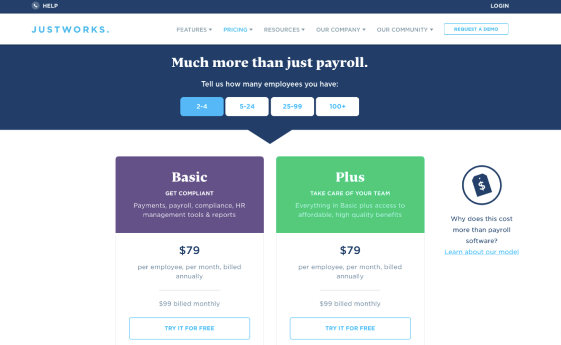
An example of options for a client from a page from JustWorks:

С - content
The question of filling selling pages with content has never been easy.
"Prices don't exist in a vacuum. Everything your company does, from marketing and sales to product management, needs to work together to create perceived value for your ideal customers," says Nicole Elizabeth De Mere, Head of Community Relations at Zest.
Think of it this way: Your customers want better billing software. Their purpose is to conveniently issue invoices.
The old saying goes that a person who buys a hammer doesn't want a hammer — he buys a hole in the wall. What is the end result that customers who buy a product/service expect? If it is flawless, then the price will go to the background.
Here are some ways to do this:
- Do not take the desired results out of thin air. Some entrepreneurs think they understand the desires of customers without actually asking them. Just as boxing doesn't cry, business doesn't rely on guesswork. Base your assumptions in real, qualitative, and quantitative research.
- Don't limit yourself to simple answers. What people most want is not having another app on their phone or buying software at a lower price, feeling a certain way, and so on.
- Clearly articulate your value proposition. The desired outcome of your ideal customer is closely related to your value proposition. In fact, your value proposition must include the desired result of the target audience, or you simply did not achieve the product's compliance with the market.
- Show that you always deliver on your promises with user-generated content. This will not be included in the pricing page, but may support conversions.
- Price is based on perceived value – this is what consumers find useful to themselves, not a cost based on the quality of the material and work. Essentially, when a customer believes they can get what they want out of a product, you're justifying charging an additional fee for it.
Content and design are constantly interacting with each other, and pricing pages are no exception. Your design choice should be based on options that fit the customer's needs.
Don't plan for a hammer – plan for a hole in the wall.
A few useful tips for creating a pricing page:
- People's attention is running — don't expect them to read every word;
- No one wants to find out anything on their own – inform customers;
- Happy customers are easier to convert.
Your DOC must follow the same truths. Make sure that the page design is not distracting by offering as few options as possible and a high level of content. Because while there may be 24 flavors of jam, people really only need 2-3.
