Web Design Trends in 2022
title: Web Design Trends in 2022 slug: web-design-trends-in-2022
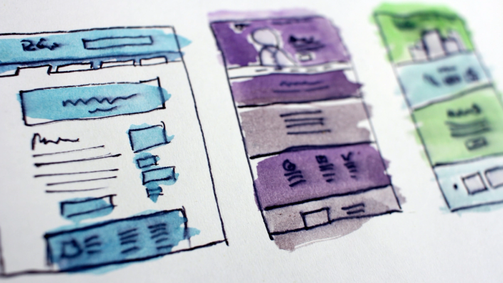
Modern web design trends in 2022 will bring a lot of new to website developers and businesses, reflecting technical changes and growing user needs.
As in the case of fashion, the design of sites often changes, but also returns. When developing sites, it is worth being aware of current and future events and understand what users may like, and which of these things should be implemented in future projects.
In the case of effects and visuals in general, words cannot always reflect their true essence, so in our material we will focus on a large number of examples. Thanks to this, we will see how each of the trends looks in practice.
So, let's get acquainted with the latest web design trends for 2022.
Modern minimalism
Minimalism will probably never disappear from the list of web design trends. It's so versatile that it would be a pity to give up simple blank pages. But this does not mean that we should bet on a white background with a black inscription.
Minimalism as a direction of web design is a specific topic that requires careful interpretation. The most important thing is to prevent the form from exceeding the content of the page, and users will be satisfied.

Font Game
Purposeful and charismatic web design. For someone, it may be heavy, but if the site concerns topics related to art, design or even we want to create a portfolio in the form of a site, then this style will attract attention. It can take a permanent form and works well with interactive elements.
Boldly playing with fonts, we do not need to focus on illustrations for this style. We are even able to abandon them, and if not, then we should not be afraid of a situation where the text is superimposed on a graphic element – this is a desirable artistic procedure.

Neo-brutalism
Talk of modern brutalism has been going on for a long time. Similar to playing with fonts, their style and size, this web design trend of 2022 is unlikely to appeal to everyone. Very characteristic and expressive. Don't exaggerate, but bold combinations of colors, graphics, and fonts can give you the impression of saturation.

Functional scrolling
Due to the fact that the performance of mobile devices increases every year, the growth of their characteristics has an impact on web design and upcoming trends. This is clearly evidenced not only by the introduction of "heavy" animations, but also by creating a scrollable story from them or setting a starting point that would attract the user.
Using such functional solutions (although they are quite complex), we have a much better chance that our user will stay on the site longer and want to get acquainted with more content.

Virtual Reality
Virtual reality is increasingly entering our lives. Of course, we meet her in movies, clips, games or on websites. This form of design can be extremely useful for sites offering, for example, the sale of furniture and real estate, but this is not a limitation. Creativity is important.

Microanimation in web design
The theme of minimalism reappears. Of course, micro-animations were used before, but now it is time for their popularity. This web design trend of 2022 enlivens the site and your offer on it, and can also become an element of entertainment.
Through greater interactivity, we increase the level of UX. This technique works, for example, in the case of e-commerce, because the offered product becomes more attractive and tangible, which greatly simplifies its purchase.

Dark Mode
The dark mode has taken up most of the social media. Of course, this is not something mandatory, but an alternative to the standard color scheme. Why did so many people choose it, abandoning bright framelights? For some, this is a matter of aesthetic preferences, and for someone it is just convenience. The dark mode is less "flashy", so if the user spends a lot of time in front of the screen, he will be more comfortable.
The next step can also be to provide the site with a choice, that is, a switch thanks to which we can select the preferred color mode.

Color gradients in web design
Gradients are back in favor. Officially, they never lost their popularity, but very often the color effect was associated with only two options: rainbow or black and white.
Some time ago, they were used only as a background. You can now use them as a fill for selected text or add depth and dynamism to your artwork. In short, gradients become more textural than the background itself. They allow you to create a smooth transition, and thanks to the appropriate selection of the color palette, we get a modern look of the web page.

Focusing screen
This effect will hint at glassmorphism (as well as neomorphism). However, as the name suggests, here we add the impression of glaze. This effect is based on giving the object a certain level of transparency, blurring the elements directly behind it and controlling the shadow.
Frosted glass will work well in laminated projects. Pages remain light, pieces of content won't be abruptly separated from each other, and yet it will remain transparent.

Neomorphism
The fashion for neomorphism continues. This is an extremely economical style – both in terms of the use of colors and in terms of the number of elements. It is based on shadows and minor color changes (still in a similar tone).
Among other things, we create the impression of extraordinary purity, which allows you to focus the user's attention on important content, minimizing visual clutter. This approach will work best in mobile app design.
Importantly! Since buttons and other elements do not contain contrasting colors, the design must be created very skillfully, otherwise we can harm ourselves.

3D animation in web design
As with scrolling, thanks to three-dimensional animation, we can tell a story, engage the user and increase the time spent on the page. 3D animation is a step forward, but in the same way it allows you to catch the message and add depth and realism to it. This allows you to better imagine a product, space or idea.
Let's not forget that such an animation will be much heavier than the graphics (or even more so the font itself), so it is important to take care of the technical aspects. Animation should be compressed as best as possible and tested to see if it slows down the loading of the site.

Retro
1970s, 1980s, or maybe '90s? Each of these periods we can imagine under the slogan of retro web design trends. By introducing such elements into the project, we get something funny (in a good way), creative and, contrary to appearances, modern.
For example, inspiration from the mid-90s allows the user to have fun: expressive colors, simple, faceted shapes and high saturation. To some, this may seem kitschy, but on the other hand, it guarantees the originality of the page and creates a unique atmosphere and nostalgia around it.

Side scrolling
We fully agree that top-down scrolling is more natural and intuitive, especially for people viewing content on a computer. However, such an alternative will bring a little originality and surprise.
It is also worth adding that in the case of mobile users, this will be a fairly comfortable experience like viewing photo galleries.

Bright space
It is difficult to call it a style, but, of course, a clean bright space affects the perception of the project, its message. This is nothing more than the free space left between the elements placed on the page.
To some, this may seem like a waste of time, but ultimately a lighter space raises the level of aesthetics. Negative space, as we can call it, is common not only in web design, but also in graphics.

Bonus: Other Current Web Design Trends
Below we will give a few rules that have recently become a priority in the development of sites and the design of web pages. These trends will remain relevant even in the next 3-5 years (minimum) and therefore require close attention.
Fast loading
It's a rule that will never go out of style, but it's certainly going to get tougher every year. Currently, loading a website in 2 seconds is the standard for commercial websites/online stores. This is not the design of the website, but on the other hand, the visual design and its elements affect the speed.
Voice Search Optimization
This is not the first or the last functionality arising from the requirement to quickly obtain information. Increasingly, instead of typing the search word, we use voice search built into Google, Yandex and other top search engines. To ensure better positioning of the site, take care of the optimization of voice search.
Design for two fingers
Everyone knows that a good website needs to be responsive. The location of important elements will affect the convenient movement around the site from the phone screen. Due to the fact that most often we use the thumb (sometimes the index finger), care should be taken to ensure that the most important sections, for example, buttons with redirection, are within reach of the finger.
Chatbot
Since modern Internet users love convenience and appreciate quick feedback, it is worth thinking about a chatbot that can not only help our recipients 24/7.
These are not all the trends that we will encounter in web design in 2022. During this time, many new ones may appear. Of course, we are not obliged to transfer them all to the design of our sites, but it is worth getting acquainted with them. One style is better suited for a store, another for a portfolio, a third for a business page.
Do you have any questions? Contact us and get professional advice on any aspects of website development.
Previous Article
Reasons for low conversion of an online store
My name is Ubaid Ullah, and this is my website and digital garden🌱.
I design and develop websites.