How should the product card look like in the online store
The development of a product card in an online store requires special attention, since this element must effectively interact with the buyer and sell.
Pages that feature individual products are an important element of an online store. Their quality largely depends on whether the buyer decides to make a purchase. In this article, we'll show you what elements you should pay attention to in order to create product cards that are user-friendly, eye-catching, and sell successfully.
A product card is part of your communication strategy. Therefore, when creating it, you need to take into account four elements, namely the mission, target audience, appearance and language.
- Mission: It's important to tailor a product page to your brand's values.
- Target audience: the product card should address a specific target group in an understandable language, appealing to its values and priorities.
- Appearance: the design of the cards should correspond to the rest of the site, as well as other graphic objects such as folders, booklets, banners, etc.
- Language: Should be the same for all communication channels – if your tone of communication is informal, you should avoid formal phrases in communicating with the audience. This will make it difficult to create a brand image, its recognition and customer trust.
What elements make up the product card in the online store
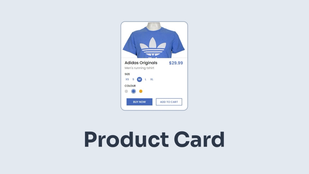
Product pages consist of several elements. The most important ones are photos, descriptions, pricing, and CTA (call to action) buttons. You can also often post customer reviews and additional products here.

Product Photos
Adequate supply disclosure is key in internet marketing. It is the photos that largely affect the perception of goods by buyers.
In the case of online stores, the correct presentation is very important. A potential buyer does not see the real product. Therefore, photos play a decisive role.
The language of advantage plays an important role. And not just in texts. The graphics should show what the buyer will receive from this product. Therefore, it is necessary to highlight those features of the object that will be important from the point of view of its future user.
It is best to demonstrate the product in use. Clothes will look better on the model than on the table. Furniture or accessories will look better in a landscaped interior than on a faceless monochromatic photophone.
Try to show the goods from different sides. Thanks to this, it will be easier for the user of the store to imagine his appearance. Pay attention to the details that distinguish the product. If the product has several options, it is better to demonstrate all the configurations on the site. This will help the buyer to decide.
Product Description
A beautiful description of the product should complement the photos. As with graphics, descriptions should focus on the customer's needs and the benefits of using the product. When describing clothes, you should pay attention, for example, to the fact that the material does not crumple or it is waterproof. In the case of furniture, it is good to pay attention to features such as ease of use and ease of cleaning.
Product descriptions on the site should be brief and specific. Poetic phrases in this case will not work. Users are looking for brief information that will help them make a decision about the choice of a particular product. The length of the text depends on the nature of the article. However, it should not be less than a few hundred characters.
Properly constructed descriptions are of great importance for the search engine optimization of the site. Search engine users often seek to find a specific product category (such as a raincoat) or even a specific product (the XYZ cloak).
Therefore, you should include this information in the descriptions, which is also necessary in terms of the usability of the online store for your customers). It's helpful to include keywords related to your industry (e.g., clothing, fashion) in your descriptions.

CTA button
The button is a small but extremely important element of the product card for an online store, clicking on which starts the purchase process. Any purchases in an online store are most often made by clicking a call-to-action button (abbreviated as CTA), such as "Add to Cart".
First of all, the CTA should be clearly displayed. A user who wants to buy an item should have no problem finding this button. Therefore, it is better to place it at the top of the product card so that it is displayed immediately after opening the page.
Price
The price of the product should also be clearly visible at a glance at the page. Moreover, some users open several pages in a row, comparing prices. Accuracy and completeness are important here. Your customer should be informed of all the costs they will incur, including shipping, additional services, and so on.
Customers' opinion
The positive opinion of people who have previously taken advantage of your offer is a factor that encourages you to make a purchase. It's a good idea to post reviews and ratings on the product page. The most familiar and visual form of publishing customer opinions is in the form of asterisks or points.
Additional Products
If the buyer is interested in a specific product, it is worth offering him something in addition to the offer. Did he buy shoes? He will probably need shoe care products.
Samples of product cards for the online store
Although the elements of the product page are of the same type in most cases, the product card template may differ. Below we have collected for you some examples of well-designed cards with a brief description and comments.
Asos

The main thing that catches your eye is a large photo of the product presented by the model. Thanks to this, you can clearly see the cut and how the fabric fits the body. On the left, we see a photo gallery representing the product from different perspectives. We can also look at the details. The video clearly shows how the product looks in motion. It is worth paying attention to the muted background and careful drawing of real colors.
The description of the product in the Asos online store is very brief and focused on specifics. The size drop-down menu allows you to quickly select. The CTA button is the only (not counting photos) color element on the page, thanks to which it is clearly visible.
Nike

In this case, a decision was made on a different way of presenting the product. We can see at the same time 4 photos that represent the product from different sides. On the right is a photo of the product in a different color. Thanks to this, the customer will quickly see all possible colors of this model.
Samsung

In this example, you should pay attention to how the product is presented in the photo. On the screen, we see bizarre shapes that visualize the display of graphics in perfect quality. These images allow you to imagine the size of the product.
Select a model size by clicking one of the three clearly visible options. A visual assessment of users confirms the high quality of the product. The creators of the Samsung website also took care of the demonstration of additional products.
Instead of an afterword
The product card of an online store is one of the most important factors affecting the decision to buy. That is why it is worth spending enough time and money on its development. If you want to create an online store, but you have no experience in creating and launching sites, use our Services. Contact Now

My name is Ubaid Ullah, and this is my website and digital garden🌱.
I design and develop websites.